Monday, 12 December 2011

Ideas Development and Design

An early Ideas concept for 'the Joker' character from 'The Dark Knight'
These are 2 alternations of the starting point- A scarred smile-with influences from past joker manifests
The most recent Batsuit was altered due to aesthetical reasons, the Batman Begins suit made it impossible for him to turn his head, everything here is designed to serve a purpose, for example the armour plates are positioned to create an advanced ratio of movement to armour protection
The new design for the Superman suit, this is a design that stays true to the original but makes tweaks and alterations to make it modern and relevant, such as the new sleeves and absense of red briefs
Here is the design for the final manifestion of ezio in the console game series 'Assassins creed' ( Revelations) This design brings in an elemet of fur to make the aged Ezio more 'feral', also he is drawm more top heavy to show his strength and wisdom, more animal in nature. Also this ensemble is grey in contrast to his previous two traditional white and red robes.
Here is Jak from 'Jak and Daxter' throughout the trilogy, at the point of the sequel (middle manifestation) the series was moved into the future via time-travel and became a lot darker in nature, the character is also 2 years older so would have some differences such as his trademark 'goatee'.


Monday, 21 November 2011

Design and Art Direction

I created, from a range of 13 primary Ideas, a solution to the brief, I came up with 'Splorin': a mobile phone application/game that overlays information over a camera sat-nav, this also responds to QR codes on walls and key objects/ locations that linked to websites and games/apps.

I have learnt to overlap and converge mhy ideas into one working concept.

I could use this in future to refine my ideas, I also find it very useful in this process to be asked questions about my Idea, this helps me find and deal with flaws.

This was sucessful because it involves a realationship between the physical and the digital world, I also thought about the propoganda element and real world uses.

This could be improved by creating prototypes and generally more design work.

Inspire people to become an Internet Explorer, through both a digital and real world experience.


Creative Challenge
When it comes to using the Internet many of us are stuck in a rut. We just visit the same handful of sites, blogs and pages again and again, week after week. When you consider what a vast, colourful, wonderful world the Internet is this behaviour is a bit like never leaving the street you are born on.
Some internet browsers (Chrome for example) encourage this ‘content bubbling’ approach, directing users back to their ‘most visited’ sites again and again in an attempt to make
their on-line behaviour predictable (and easier to serve adverts against). Internet Explorer however believes that we should all explore the wonderful world of the internet as fully as possible - get off the beaten track and see what cool stuff is out there.
Your challenge is to remind a tech- savvy audience of what a rich and exciting place the Internet is and then inspire them to get out of their ‘web- rut’ and go exploring. We want to see how you would incite our audience to become ‘Internet Explorers’.
Target Audience
Tech Trendsetters - 18-25 year olds who love technology and what it enables them to do. They are united by their curiosity and a desire to ‘get there first’ whether that’s a new piece of technology, a new website or a new piece of content. They want to be
the first amongst their peers to send round the new thing.
Considerations
Successful entries will be a campaign that can stretch from the digital world into the physical. How can we seamlessly marry a great (HTML5) digital experience with stunts, events or ideas that can live in the real world.
We are looking for work that will drive downloads and usage of the current version of Internet Explorer, but the idea doesn’t need to be advertising in the traditional sense.
You should consider how we can revitalise and challenge some of the existing pre-conceptions of Internet Explorer as a brand. How can we make choosing Internet Explorer as a browser say something positive about your attitude towards the Internet.
Mandatory Requirements
The campaign should have at least one digital component and one experiential / real world component. This could be advertising ideas, content ideas mobile or website ideas for the digital component and event- based, PR or advertising ideas for the real world element.
Create a short, clear and concise presentation of how you would marry the real world experience with the digital and the consumer’s journey through the campaign and how this will inspire exploration of the web.
Background
Internet Explorer believes that the Internet is the most marvellous place that there is. We believe that being connected is nothing without the curiosity to see where those connections take you. We believe that this curiosity, this desire to explore is something that everybody shares no matter who they are, and that all of us deserve the best tools possible
to satisfy that curiosity. That’s why we called our product ‘Internet Explorer’ - because the Internet demands more than idle browsing or skimming surfing - it’s there to be explored. So let’s go exploring.
Internet Explorer is the nation’s no.1 Internet browser. We’re at the cutting edge of browser technology - giving people the tools to explore the Internet in a way that is faster, safer, more practical, more individual and more visually exciting than ever before. We’ve been helping people explore the internet for longer than any other browser and today we provide the gateway to a more fulfilling web experience.

Monday, 14 November 2011

Interactive Media


  • Literal- A flash character (a wizard) with outstretched arms as if casting a spell
  • Abstract- The character pertrudes the picture as if casting a spell
  • Cultural- this is 'Magical Trevor', an internet famous satiical character from a web series on 'Weeblstuff', his character is generally loved just for being one of those 'Eddie the eagle' types of people who try hard but dont do much impressive.


  • Literal- A web browser, Google website
  • Abstract- The search bar is a place for opportunity and many outcomes, this picture may caue someone to investigate all of its aspects
  • Cultural- Possibly the biggest search engine and website of our time, Google is usually a homepage as it takes you to many websites from a search, it acts like a gateway, so even a picture of this comes with all of the baggage as it has become iconic


  • Literal- Some sort of motocross game with the title (title screen)
  • Abstract- May intruigue the viewer to find out about the game
  • Cultural- A lesser known game but a well know format, a 'Tea games' creation


  • Literal- A screenshot of google earth software
  • Abstract- Informative, shows the aspects of the software and capabilities
  • Cultural- This is a very well used piece of software as it is hi-tech and available to map the world and plan routes and directions


  • Literal- two men interacting with 'Xbox kinex', Propaganda image for interactive tech
  • Abstract- Friendly competition, advertising the interactivity between character models and physical people
  • Cultural- A fairly new technology in which you can control characters with just your motions, this informs the basic principles


  • Literal- Box art for a N64 game including many Nintendo characters such as Mario
  • Abstract- The purpose of the image is to advertise in the same principle as a book cover, the eye is drawn to the word 'smash', this links the overal theme and feel of the game
  • Cultural- This is exciting for Nintendo fans as it was the 1st to incorporate so many characters from different games, also its a great game and is satisfying to set them against eachother in an arcade fashion.

Scientific Images or Optical illusions


  • Literal- A black and white patter that gives the 3D illusion of a sphere
  • Abstract- A Spere made from dice patterns
  • Cultural- All Optical illusions work because of our depth perception, they work because of the human eye and cause us to gain metaphorical meaning such as 'things are not as they seem' 

  • Literal- arrangement of 4 black square outlines or a mixture of black and grey squares
  • Abstract- 4 3D cubular pyramids
  • Cultural- Makes you think 'are the pyramids 3d toward me? or hollow going away indented?

  • Literal-4 Circles missing 90 degree chunks
  • Abstract- The portions give the illusion that a white square is present, however it is the negative space, our brain completes the shape
  • Cultural- Used in visual exercise, it is difficult to see the circles without seeing the square


  • Literal- a green circle with a blue dot at its centre
  • Abstract- a green splurge of colour, if you stare at the blue dot in the middle it disappeares after shrinking
  • Cultural- tells us about our colour perception


  • Literal- A man standing on a triancular pyramid shape over a huge drop in turrain or a man standing on a specific point in a floor painting
  • Abstract- the man appears to be ballancing on a thrusted object over a huge drop in the ground, this could be eluding an 'into the void' theme and makes us think about what he may be about to do
  • Cultural- the image will only work from looking at it from the point of the camera, the actual image is much wider but gives the illusion of depth

  • Literal- An organisation of black and white blocks intersected by slanted rows of lines
  • Abstract- The rows appear to be moving even tough they are static
  • Cultural- the difference in colour causes us to percieve motion where there is none

Media, Advertising and Propoganda

  • Literal- A Feathered white outline of a triangle, half intersected by an identical line frayed at the end, from the opposite side a rainbow formation protrudes
  • Abstract- The white beam of light seem to split into its colour formation because of the triangle shape
  • Cultural- Using a class triangle shape and a beam of light, something similar can happen for real, this is an album cover for pink floyd, the theme achieved is about the man intricate things that make up a singularity
  • Literal- A picture of a burger with a clever caption, Mcdonalds advert
  • Abstract- The informal caption plays on the fact that you are reading it whilst in a train/subway station and creates humour around the idea of how good the burger looks
  • Cultural- The Advert instills a humorous message and attitude that makes you agree with Mcdonalds claiming how good the product is
  • Literal- A face half cast in light, with blood red eyes and matching colour title
  • Abstract- The face seems to be comig out of the shadows and looking at you, this is threatening and chilling as if about to attack
  • Cultural- this is a big film sequel involving a very established horror character (Hannibal Lecter) and the mis-en-scene of the poster personifies his character, the monster within himself hiding in the shadows
  • Literal- Black and white batman and Catwoman except Catwomans' red goggles
  • Abstract- Stern Batman and seductive Catwoman, the body language suggests a clash of personality, or an unsteady alliance, Catwoman may playfully tease the serious Batman.
  • Cultural- The relationship between the characters is a complicated one, because Catwoman is a thief and Batman is a strict law enforcer, yet they have an attraction to eachother, so the clash is well represented here with the proxemics and empty space.
  • Literal- Two hooded figures side by side, colour dfferences, from the Assassins creed series
  • Abstract- The left figure is looking out of frame as if into the past, and the right figure is head on as if ready for the present fight, the characters could be somehow related or in an alliance
  • Cultural- two very imports characters in the Assassins Creed series, the game 'Revelations' ties these two characters together, althought they exist in two different eras and have never met, the have a common goal and alliance
  • Literal- A warthog and a meercat photograph taken from inside of a vehicle
  • Abstract- There seems to be a friendship between the two animals, as humans this instills joy because it shows two unlikely companions
  • Cultural- This shows reference to the film 'The Lion King' and the characters 'Timone and Pumba' some well known and ecogniseable characters. As a 90s kid this makes me happy...
Good examples of Design

  • Literal- Individual parts of a vehicle
  • Abstract- Shows the many parts used to build a kart
  • Cultural- This is known as an explosion and is used in design, this helps to understand how to build a car
  • Literal- A red and yellow Logo involving an 'S' and a shild shape
  • Abstract- A strong symbol, metalic glowing in some way
  • Cultural- The superman logo, a symbol of strength and hope in the fictitious comic book world
  • Literal- A grand building design, the sydney opera house
  • Abstract- The building embodies the sound waves coming from the building and the lighting makes it something extraordinary
  • Cultural- One of the most recognizable designs, an australian landmark
  • Literal- a balding man with a tattoo of a man with a lawmower
  • Abstract- The Tattoo appears to  be cutting his hair with the lawnmower
  • Cultural- this is an example of finding humor in a situation, shows the man has a humorous personality and doesn't take himself seriously
  • Literal- A Grecian warrior with white skin and a red tattoo desgn, the background shows a storm
  • Abstract- The figure appears to stand strong against the storm (metaphorical) and appears strong as he carries huge thallic weapons
  • Cultural- The character is Kratos from the God of War series, the character faces immense struggles and battles and so this is a very basic example of pathetic phallacy in realation to the weather, also his stance is very solid to show his strength of character

Artworks

  • Literal- A famous Japanese painting of a stormy sea, one prodomanently huge wave
  • Abstract- Uses a golden section, Japanese philosophy says that the water element (sui) represents the flowing, ever changing things in the world, so this could embody an event or phenomenon
  • Cultural- Possibly the most famous Japanese painting, called 'The Great Wave'. It captures motion very well.
  • Literal- A painting of a rural landscape setting
  • Abstract- The painting seems intricate and alive, It almost has more detail captured than aan actual photograph, the setting shows horses and a carriage wading through a river, quite a romantic scene
  • Cultural- A famous painting by John Constable, a famous English treasure
  • Literal- A woman depicted leavng her painting for a smoking break
  • Abstract- Breaks the boundaries of the canvas and plays on the fact people often take breaks from their jobs for fag breaks
  • Cultural- This is a Banksy artwork and his work usually uses a satirical feature
  • Literal- A rocky landscape filled with a concentration of people and a skyward beam of light
  • Abstract- Maybe a supernatural message or congreational event, a religious scene
  • Cultural- This is an intricate masterpiece, amazingly painted, I think this refers to the story of Moses from the Bible
  • Literal- A pointilism and ink-dashed picture of a crying eye
  • Abstract- A fundemental expression of emotion
  • Cultural- Roy Lichtenstein' style is a comic book inspired pointillism approach, this is one of his most famous

Urban Signs and Signals

  • Literal- A symbol of yellow against black, or black against yellow (positive or negative space) with the word 'Biohazard'
  • Abstract- The symbol looks like bio fumes escaping from a container in very basic form
  • Cultural- This is a recognized symbol meaning 'Bio hazard', Yellow is a caution color and is very luminous like some sort of bio waste


  • Literal- a basic sillouette of a man digging drom a pile of something in a road hazard triangle
  • Abstract- There is a running joke (not a funny one) that this depicts a man opening an umbrella, the black and white contrast are perfect contrasts so makes it more recognisable
  • Cultural- The red triangle is a recognised hazzard sign


  • Literal- A Grafitti style 'A' circled in red, unprofessional 
  • Abstract- The dashed Font looks agressive and amatuer as if done in a 'zorro' style
  • Cultural- This is the symbol for anarchism, the symbol is usually put up in a hurry just to assert their prescence so the symbol is usually rushed like this
  • Literal-A symbolic approach to a hand being corroded by acid, Yellow and black hazzard colours
  • Abstract- The Acid appears to corrode the flesh and object very prominently
  • Cultural- This advises caution mainly in science labs and is recognized around the world even as just a symbol because of the simplicity
  • Literal- A used toilet roll with an...(ahem) funny message
  • Abstract- the message personifies the situation that we have all been in and applies instant humour because of its recognition
  • Cultural- Because we have all been in this situation of modern days we recognize the humor in the situation

Historical Images

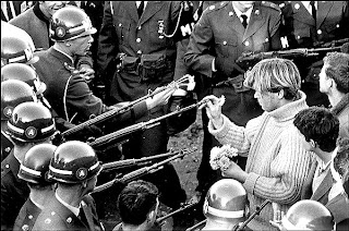
  • Literal- A man putting a flower into a gun of a soldier
  • Abstract- A message of peace against violence in favour of creation over destruction
  • Cultural- This is a famous American picture of peace, the Hippy movement in the 60s was a huge message of love and peace against war
  • Literal- An American (pretty safe to say), pointing toward the audience with the message with 'you' extra bold
  • Abstract- The finger seems to be pertruding from the image thus involving the viewer by invading the space behind the 'wall'. His stare is also intent and obviously un-blinking so catches the reader
  • Cultural- This was an army recruitment campaign, full of obvious subliminals such as highlighting 'you', this makes the viewer important and motivated to do something


  •  Literal- A cave painting of a hunting tribe, done fairly minimal
  • Abstract- Hunters hunting deer, they may soon be charged by the animals
  • Cultural- Cave painting was the earliest form of conveying a message, this could tell of a days hunting or could be purely recreational


  • Literal- A well known historical English advert for Frys' Chocolate, a series of expressions from the same boy with captions
  • Abstract- Shows the 'stages' of anticipation for Frys, It has a kind of 'call and response' idea to it, along with humour, it tells a basic satisfying story
  • Cultural- This became famous in England because of its humour and 'Frys' being based in england as an institute, many parents would hotograph themselves holding up their children next to this sign as part of the sequence of faces. 


  • Literal- many soldiers struggling to plant a flag in the ground on a battleground
  • Abstract- shows human determination and pride in freedome and their nation
  • Cultural- A very famous American image because the soldiers are shown somewhere life threatening doing something they believe to be important, shows pride in their flag, they are proud to be soldiers for their country

Brief

1. Create a new blog on your blogger.com account called The Interactive Design Project

2. Research and collect a range of images under the following headings

- Historical images (between prehistory and 21st Century)

- Urban Signs and Symbols

- Artworks

- Good examples of design

- Media, Advertising and Propaganda

- Scientific Images or Optical illusions

- Interactive Media

3. Research a range of ideas generation techniques and lateral thinking exercises

- explore and annotate ideas generation techniques and document them in a new

visual diary


- Look at methods in which artists, designers and interactive media artists use

ideas generation in their work


4.
Read and implement the information in the blackboard resource “How to
Annotate Creatively” in the Study Skills folder on blackboard to
understand how to improve your grades in all your units but particularly
in Unit 01 Visual Recording and Unit 02 Materials, Techniques and
Processes.